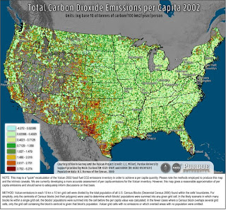
 You can click on the map to get a better look.
The map above is available at
Wired Magazine. It shows the amount of carbon dioxide produced in 100 square kilometer regions of the United States divided by the number of residents in that area. Look at Texas!
No comments:
Post a Comment