
 We tend not to want to shill for commercial products, but this new offering from Moleskine seems too compelling. The Glass House sketch book features 29 sketches by various architects, designers and artists inspired by the Philip Johnson Glass House site. It includes relevant quotes by Philip Johnson and many blank pages for your notes and sketches.
The legendary Moleskine was effectively abandoned in 1986 by its last manufacturer. But, in 1998 a small Milanese (thank you, again, Italy!) publisher brought these books back for writers, designers, travelers and, as the brand declares, "all free-thinkers around the globe."
We can't live without ours. Not sure if we will like one that is interspersed with graphics, but maybe further inspiration will flow from the offerings. Philip Johnson, wherever you are, we raise our glass, so to speak. Cheers!
BTW: ALL the tickets for 2008 tours of The Glass House...are sold out.
Friday, June 6, 2008
Preserving the Modern


Friday, May 30, 2008
Cold Beauty - The Icebergs
These gorgeous masses of ice serve as a nice segue into summer. We couldn't resist the seasonal design implications. The surprising colors you see reflect sudden temperature changes, trapped air bubbles, the mass grinding over sandy shallows, the absorption of multi-colored algae and other phenomena of the cold waters. Nature rules in the world of design. These are good examples of its effortless magnificence.


Sunday, May 25, 2008
The Square Foot Garden | Gardening Simply

Many of us stop just short of planting our own vegetable garden. Why? We find the planting and care of it daunting. To help us break through this barrier, the French (Yes, the French) have developed "square foot" gardening, also known as Biointensive gardening or the French Intensive. You don't need a lot of space or equipment. You don't have to plow, till or weed an acre or so of land and you probably don't need overalls, which may be a disappointment to some.
We know this because we found the Build a Square Foot Garden entry in Wired's new wiki. The Wired Wiki walks you through the process step-by-step. It suggests a small 4' x 4' to get started. You can create your own highly productive, simply sustainable garden. Start digging!
Painting by Duane Keiser
Friday, May 23, 2008
Happy Birthday Brooklyn Bridge!
 The Brooklyn Bridge - 6,000 ft long, 13 years to build
The Brooklyn Bridge, an engineering marvel built in 1883, and the butt of many jokes regarding gullibility ("If you believe that, I gotta bridge I can sell ya!") is 125 years old today. New York celebrated.
Tourists flock to see its interplay of architectural grace and muscle and its commanding views of the Manhattan skyline. Historians note its role in shaping the city: It linked Manhattan with what was then a largely rural Brooklyn, helping spur a growth spurt in the more rustic borough...
The Brooklyn Bridge is roughly six times as long as the biggest earlier bridge of its type, and its Gothic-arched stone towers and web of steel cables are technically impressive even by today's standards...
The Ultimate Tree House

This article, in the MIT Technology Review, is an inspiring read. It offers a peek into the possibilities of a future that is wholly integrated into the natural world. As the scarcity of resources begins to take its toll, these solutions, which even five years ago seemed like folly, take on greater urgency.
The basic framework of the house would be created using a gardening method known as pleaching, in which young trees are woven together into a shape such as an archway, lattice, or screen and then encouraged to maintain that form over the years.
Thursday, May 22, 2008
Why Symmetry? ?yrtemmyS yhW

A current Slate article explores the satisfying nature of symmetry. Here's a brief excerpt:
Why is architectural symmetry so satisfying? As Leonardo da Vinci's famous drawing demonstrated, it reflects the human body, which has a right side and a left, a back and a front, the navel in the very center. Du Sautoy writes that the human mind seems constantly drawn to anything that embodies some aspect of symmetry. He observes that "[a]rtwork, architecture and music from ancient times to the present day play on the idea of things which mirror each other in interesting ways." When we walk around a Baroque church, we experience many changing views, but when we walk down the main aisle—the line along which the mirror images of the left and right sides meet—we know that we are in a special relationship to our surroundings. And when we stand below the dome of the crossing, at the confluence of four symmetries, we know we have arrived.
On the other hand:
All exemplary Modernist buildings celebrated asymmetry: The wings of Walter Gropius' Bauhaus shoot off in different directions; the columns of Mies van der Rohe's Barcelona Pavilion are symmetrical, but you can hardly tell, thanks to the randomly spaced walls; nothing in Frank Lloyd Wright's pinwheeling Fallingwater mirrors anything else; and Le Corbusier's Ronchamps dispenses with traditional church geometry altogether.
The article offers a nice review of the symmetrical / asymmetrical perspectives.
To Catch a Thief

People in the art and design world will remember the brazen and shocking heist at the Munch Museum in Oslo, Norway in 2004. Armed robbers stole Edvard Munch's internationally recognized paintings "The Scream" and his scandalous, bare-breasted "Madonna." The paintings were tracked down by James Bond-like art sleuths and returned to the museum in 2006. (There must be a film in this somewhere.) The two paintings were displayed for 5 days, during which period an astonishing 5,500 people turned out to view them.
The drama surrounding these famous paintings continued after their return. Each was seriously damaged. The art world's efforts to restore and save them were heroic. Here is a brief and interesting piece on the intricate, micro-millimeter, process of restoring these world renown paintings which, after two years of labor, are now again on display at the Munch Museum.
Tuesday, May 20, 2008
Deep Water City States
 An artist's conception of what a large seastead based on the spur design could look like.
The Seasteading Institute envisions vast clumps of these structures
forming city-states in the open ocean. Illustration: Valdemar Duran
Wired magazine has the story on "deep water city/states." It's fascinating, and look who's putting it together.
With a $500,000 donation from PayPal founder Peter Thiel, a Google engineer and a former Sun Microsystems programmer have launched The Seasteading Institute, an organization dedicated to creating experimental ocean communities "with diverse social, political, and legal systems."
"Decades from now, those looking back at the start of the century will understand that Seasteading was an obvious step towards encouraging the development of more efficient, practical public-sector models around the world," Thiel said in a statement.
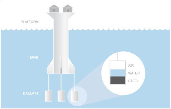 Illustration of the engineering design for the sea towers.
Build enough of these spar platforms and you've got yourself a "deep-water city-state."
 [Images: The Maunsell Towers (above), unmentioned by the
libertarian seasteaders, and the Texas Tower (below)].
Rather than architecture simply improving on the natural landscape, it would actually be giving shape to a new kind of community that will encompass intricate constitutional and political needs. In this case architecture becomes, more accurately, political space. Who's been thinking about THAT?
Sunday, May 18, 2008
Preservation : Act 1
 Provincetown Theater, Greenwich Village, New York City
Considered the birthplace of Off-Broadway and alternative theater.
So we were very inspired to read this in the NYT. Apparently after an long and arduous battle with local preservationists, New York University relented and agreed to preserve the historic Provincetown Theater in Greenwich Village. NYU's original plan was to destroy it for new campus buildings. The Theater is not actually a very old building, but its historic nature begs saving. And it will be. Thank you NYU and all of those who fought for the theater's life.
Graffiti 101 | Guerrilla Design

Understanding the mystery and language of graffiti, from I Love Typography:
Have you got that?The language of graffiti culture, like that of hip-hop culture, with which it is closely allied, is deliberately cryptic. Graffiti is meant to be readable by graffiti artists and enthusiasts, but illegible to the general public. A writer refers to a graffiti artist. A crew is a loosely organized group of writers, who often write the initials of their crew members along with their own name.
A tag is the most basic form of graffiti, a graffiti writer’s personal signature or logo, drawn in one color. The tag might include a character, which refers not to a letterform, but to an iconic cartoon figure. Tagging is the act of writing the tag with a marker or spray paint. A slightly larger and more ambitious version of the tag is known as a throwie or a throw-up. A typical throwie has a background color and an outline in a second color. The interior color of the letters on a throw-up is known as the fill or fill-in. When the second color is only roughly sketched or lined in, the throwie is known as a scrub. The most ambitious graffiti of all is work that is done on a large scale in at least three colors, often incorporating fades or blended colors. This is known as a piece, short for, of course, a masterpiece.
The plastic cap or tip on a spray paint can determines the line weight. The standard caps that come with spray paint are known as sucker tips, and are often replaced with others, such as skinny tips, thin tips, thick tips, fat tips, or flare tips. The largest fat caps are sometimes known as softballs because of the soft round marks they make. Line width is sometimes described in fingers. A four-finger line is, for instance, about as a wide as a hand. Bubble letters, quite out of fashion now, were an early style of graffiti lettering with a rounded shape, and roller letters are large-scale tags drawn with paint rollers. To bomb an area is to profusely cover it with tags or throw-ups. To kill an area is to bomb it beyond a point of diminishing returns.
Film and Architecture
 In a recent plug for a screening of "Last Tango in Paris," director, Bernardo Bertolucci's (He was 31 years old at the time!) controversial 1972 film starring Marlon Brando and Maria Schneider, The New Yorker film critic Anthony Lane said an interesting thing. Referring to the many elements of this classic film that are smothered in the explicit carnal aspects, Lane says this:
It was hailed as a breakthrough and also viewed with trepidation when it first showed in New York, in 1972, yet the public's reaction was so focused on the movie's carnal bravado that its other, more furtive concerns may have escaped attention. In its reading of architectural space, for instance---of the way in which bodies can lose themselves in rooms---it has few peers..."
Now you have a righteous excuse to go Netflix "Last Tango in Paris", a movie in which terrible despair stokes intense desire---one of the most shocking and sexually explicit movies in film history. See it for the architecture.
Saturday, May 17, 2008
Brooklyn Rocks

As prices rose in New York City, the creative class moved to the outer boroughs, leaving the merely rich behind. Brooklyn, especially, has become a center for up-and-coming furniture and product design. We thought this little Dwell montage on Brooklyn street fashion had something interesting to say about the culture of design and its buoyant power of invention.
Friday, May 16, 2008
Saving Grace.
This video chronicles, in a most entertaining way, a community's commitment to saving a 100 year old church. It is part of the National Geographic series, "Monster Moves."
The presentation gets a little schmaltzy, but, in Baltimore, where the city casually tears down historic buildings, usually in the dark of night, as if they were mere trash, and people weep in frustration and dismay, it is great to see the collective genius of a community in love with a building, any building.
This is not animation, as it feels in the first moments. It is, for the most part, time-lapse photography.
Monday, May 12, 2008
Please be seated.

Have you ever wondered WHY airline seats are so uncomfortable, so stressful, so poorly designed? We certainly have. Our bodies have on occasion felt they were going into a lower body, arterial thrombosis after 5+ hours in the friggin' seats.
Well cash-strapped Delta Airlines has come to the rescue. By 2010 every Delta international, economy class section will be outfitted with newly designed seats. Could domestic flights be far behind? Here's some interesting facts about the research that went into the design improvements. Yes, research!
Because international travel is so fiercely competitive, other airlines will be forced to meet the challenge. Help is on the way! Say hello to your lower body, your shoulders, your neck. Say, "Bonjour Paris!"
Sunday, May 11, 2008
I left my _______ in San Francisco?
 Liz Hickok, San Francisco
 Zhan Wang, San Francisco
The kitchenware exhibit is constructed by Beijing-based artist Zhan Wang. The jello exhibit, is the work of Liz Hickok, one of America's, perhaps, happiest artists. It is interesting to juxtapose the hard surface of Wang's materials against the soft surfaces of Hickok's, and, it is always fun to see architecture in a different light.
Friday, May 9, 2008
Architecture of Libraries
 BNF - Paris
The photos in "Libraries" offer a good opportunity to examine the vernacular of the library in the venerable role they play as a repository of precious objects. But, forget the books for a moment and consider what it is about the design of a library that signals "library," even if the books were removed. Could these structures possibly be anything else?
Thursday, May 8, 2008
50 Ways to Help the Planet

Here's the list. Just do it. (We also like the clear, spare design of the list.)
Tuesday, May 6, 2008
Worlds Away
After posting our thoughts about the edible front lawn, we became aware of this wonderful project at the Walker Art Center in Minneapolis,"Worlds Away: New Suburban Landscapes."
The Walker asked residents to make their own videos, no longer than five minutes, about their experience of suburban life. One of our favorites is the one above. The result is both hysterical and touching. The suburban culture continues its controversial existence as it dominates the lives of so many Americans. The Walker attempts to reveal more than a sociological, political or historical perspective. As an expression of community,the show features the colorful insights of those who dwell there. The encouragement of community participation promotes a lively dialog. We like that!
(Hat Tip to Ms. Eby in Tallahassee)
Sunday, May 4, 2008
Architecture of Invention
This is a video about William Kamkwamba, a teenager in Malawi, Africa. He was forced to drop out of school because he family hadn't the $80 required for tuition. Even though he was unable to further his education, he was determined to be useful.
To be so, he figured out how to build a working windmill from old parts after seeing a picture in a book. His windmill produced the first electricity his village has ever had. It is a great tribute to the human capacity for generosity and ingenuity, not to mention...functional design. As we use wind to reduce our petroleum consumption, others are using it for mere survival. Watch. It is a moving story.
Here is a link to William's blog, now that he is on the internet!
Wednesday, April 30, 2008
Architectural Sound

The work of architecture includes getting rid of sounds. No architect to our knowledge designs with sound, except in the instances where a water feature is added in an indoor or outdoor space. Mostly architects are trying to quash it. Or, they design to enhance sound, as in symphony halls or music studios. Over at BLDGBLOG, they have come up with a delicious and twisted idea. You have to think about it. They are talking about a man who felt that the music he had listened to had produced a sense of particular spaces, an architecture, if you will. The blogger says:
What if those subtle and distant architectural sounds (he had imagined) had actually been part of the CD? This would be music as the illusion of architecture. You could move into a house without a basement – so you purchase this CD, or download these tracks, and you uncannily achieve the sonic effect of having more floors below you. Or perhaps you want an attic, or even a next-door neighbor: you would buy soundtracks for architecture, architecture through nothing but sound.We can hear the sound of the future. Right now we're commissioning the sound of floor to ceiling bookcases. First the bookcases, then the new neighbor.
For instance, think of the Francisco López album, Buildings. Buildings is "a work composed entirely of sound fragments López procured while wandering around big buildings in NYC," recording the "sounds of elevators, air conditioning systems, cables, pipes, air ducts, boilers, clocks, thermostats, video cameras, and so on." (You can actually listen to a brief excerpt).
So instead of an addition, or a home renovation – you would commission a piece of music; and for as long as that music is playing, your house has several thousand more square-feet... and a Tube line nearby... and distant boilers...
Edible Estates: Attack on the Front Lawn

The author, architect and artist, Fritz Haeg, tells us how to turn the front lawn into a beautiful, edible garden. If you are curious about turning your patch of land into a useful territory, Haeg's book is very helpful. He is joined by architect Diana Balmori, garden and food writer Rosalind Creasy, author Michael Pollan, and artist and writer Lesley Stern. Together this team also places the book into the context of the larger issues of environment, global food production and the imperative to generate a renewed sense of community in our urban and suburban communities.
Great design, photographs, garden descriptions and terrific stories from around the country by people who eat the yard. We recommend it. AND, if you are really intrigued with the curious sociology and history of the lawn and those besotted by grass, we further recommend the The Lawn: A History of an American Obsession, by Virginia Scott Jenkins. A great read!
Monday, April 28, 2008
Design Adventure
Were it not for our friends, we may have missed this marvel of engineering and design at the gorge in El Chorro near Alora in Málaga, Spain. If you are a hiker or climber, you will especially appreciate this bridge. The building of El Caminito del Rey (Pathway of the King) began in 1901, and was completed in 1905, lord knows how. It is three feet wide, 700 feet above the river and in many places supported by 20 and 30 foot posts. Some background information at the Wiki, provides a fuller, though sketchy history of this infamous passageway. You'll notice, like all of your adventures, there is background music. Grab your bolting gear and locking carabiners, this walk could kill you.
Design for the Natural World
 Pierre the penguin, who is now 25,
struts his stuff in his neoprene "suit."
California Academy of Sciences
Tuesday, April 22, 2008
Do-Ho Suh
Do-Ho Suh is fast becoming one of the most recognized artists in the world. A Korean conceptual artist, his work was recently on exhibit in NYC at the gallery lehmann maupin. His most recognized piece from that show is this, "The Perfect Home":
Suh creates meticulous, site-specific environments and he manages installation space like a sculptor or architect. Here is a nice reference on his work as well as an interview with him at DesignBoom. Keep your eye on Do-Ho!
Earth Day : Earth Art
 We wanted to plant a post to honor Earth Day, as well as Baltimore Green Week that is fast approaching. Uh, like next week. Get your green genes going.
So we thought we'd link you to the U.S Geological Society's (USGS) EROS program (this EROS site is a great resource, even for the non-Geo-sensitive). A segment of the EROS program is Landsat 7. This joint program between NASA and USGS sponsors a series of satellites with highly technical cameras (of course!). This series of satellites roams the skys and take pictures of the planet that can only be described as "earth art."
Hope you enjoy the beauty of this earth through these images of some of the most striking and exotic places on the planet. Wonk on!
USE THE SPACE YOU HAVE : Works in Progress
Often a homeowner's first thought when they are running out of space is to add an addition. This home is a good example of another way to solve the space problem. When we saw the interior, we were able to determine that the small, unused attic provided all the space that this family needed, at less cost than adding an addition. The attic can now serve as a full second floor with two bedrooms, a much needed office and two baths.
To create this new space, we added dormers, sky lights and a new stair. We were able to maintain the original footprint, the house's historic character and, importantly, the proportions of the original house. We think it is a good way to enlarge a house and bring daylight in, while at the same time maintaining its character in the community. This solution also fit with our sense of environmental ethics: using what we have, reducing our impact on the earth and supporting the ideas of the not-so-big housing movement.
 BEFORE - exterior side
 AFTER - exterior side
 BEFORE - exterior rear
 AFTER - exterior rear
 BEFORE - interior
 BEFORE - Interior
 AFTER - interior
 AFTER - interior
 AFTER - interior skylight
 AFTER - new bathroom taking shape
 AFTER - new stairway underway
Saturday, April 19, 2008
Mental Health Break
 Click for a better look.
Wednesday, April 16, 2008
More foot prints, the carbon kind.
 You can click on the map to get a better look.
The map above is available at Wired Magazine. It shows the amount of carbon dioxide produced in 100 square kilometer regions of the United States divided by the number of residents in that area. Look at Texas!
Tuesday, April 15, 2008
"Inferior Architecture for Culture in Decline"

 Roland Park Enoch Pratt Library, models
In the early 1990s, New York Sen. Daniel Patrick Moynihan spoke of "defining deviancy down," by which he meant that Americans were becoming more tolerant of bad behavior. During the last three decades, much of what has been built in this country has also been "defined down," falling short of standards adhered to earlier
Read on.
(Sorry we were unable to snag an image of the Raymond Loewy, Caldor Building addressed in Miller's article.)
Friday, April 11, 2008
The All White Abode

For anyone who may have wondered what it would be like to decorate in all white, here is an example of a loft in Paris done just so. The owners seemed to have pulled it off. The coldness we expect in an all white space doesn't arise. The space seems warm and welcoming. Of course, there are other touches helping, textiles, wood, cushions and other subtle colors warm the place up. It's nice to see what the mind could only imagine.


 Posts
Posts

